
Building scalable design systems for enterprise applications
Most companies struggle with maintaining design consistency as they scale, but for enterprise applications, a robust design system isn't just nice to have—it's essential for productivity and user experience.
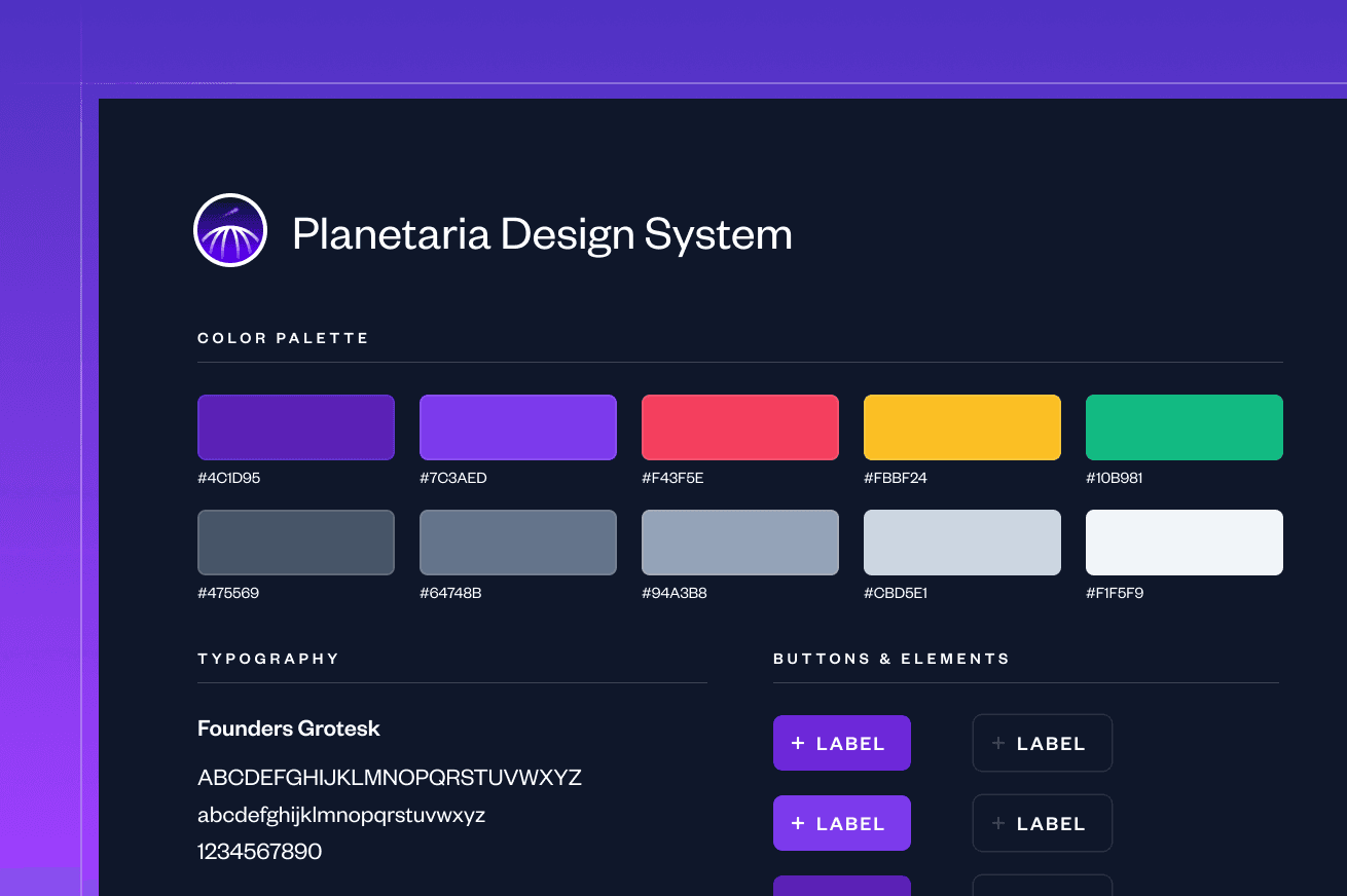
At Skaler Labs, we've helped numerous clients implement design systems that not only improve visual consistency but also accelerate development velocity and reduce maintenance overhead.
The Foundation: Component Architecture
A well-designed system starts with a solid foundation. We begin by auditing existing components and identifying patterns that can be standardized. This process involves:
- Component Inventory: Cataloging all UI elements across the application
- Pattern Recognition: Identifying recurring design patterns and interactions
- Technical Analysis: Understanding the underlying code structure and dependencies
The goal is to create a comprehensive component library that serves as the single source of truth for all UI elements.
// Design System Component Example
interface ButtonProps {
  variant: 'primary' | 'secondary' | 'outline';
  size: 'sm' | 'md' | 'lg';
  disabled?: boolean;
  children: React.ReactNode;
}

const Button: React.FC<ButtonProps> = ({
  variant,
  size,
  disabled = false,
  children
}) => {
  const baseClasses = "font-medium rounded-lg transition-colors";
  const variantClasses = {
    primary: "bg-blue-600 text-white hover:bg-blue-700",
    secondary: "bg-gray-200 text-gray-900 hover:bg-gray-300",
    outline: "border border-gray-300 text-gray-700 hover:bg-gray-50"
  };

  return (
    <button
      className={`${baseClasses} ${variantClasses[variant]}`}
      disabled={disabled}
    >
      {children}
    </button>
  );
};
This approach ensures that every component follows consistent patterns while remaining flexible enough to accommodate different use cases across your application.
Implementation Strategy
Once the foundation is established, the implementation phase focuses on creating a sustainable system that developers will actually use. Our strategy includes:
- Documentation First: Comprehensive documentation with live examples
- Developer Experience: Tools and workflows that make adoption seamless
- Version Control: Semantic versioning and migration guides
- Testing: Automated testing for consistency and accessibility
- Governance: Clear processes for updates and contributions
The key to success is making the design system more valuable than the effort required to use it. We focus on creating tools and processes that reduce friction for developers while maintaining high standards for design quality.
// Design System Usage Example
import { Button, Input, Card } from '@skalerlabs/design-system';

const UserProfile = () => {
  const [user, setUser] = useState(null);

  return (
    <Card>
      <Input
        label="Email"
        value={user?.email}
        onChange={(e) => setUser({...user, email: e.target.value})}
      />
      <Button
        variant="primary"
        onClick={handleSave}
        disabled={!user?.email}
      >
        Save Changes
      </Button>
    </Card>
  );
};
The result is a design system that not only improves consistency but also accelerates development. Teams can focus on building features rather than reinventing UI components, leading to faster time-to-market and higher quality user experiences.